ICA Shop Rebranding Project
The Ask:
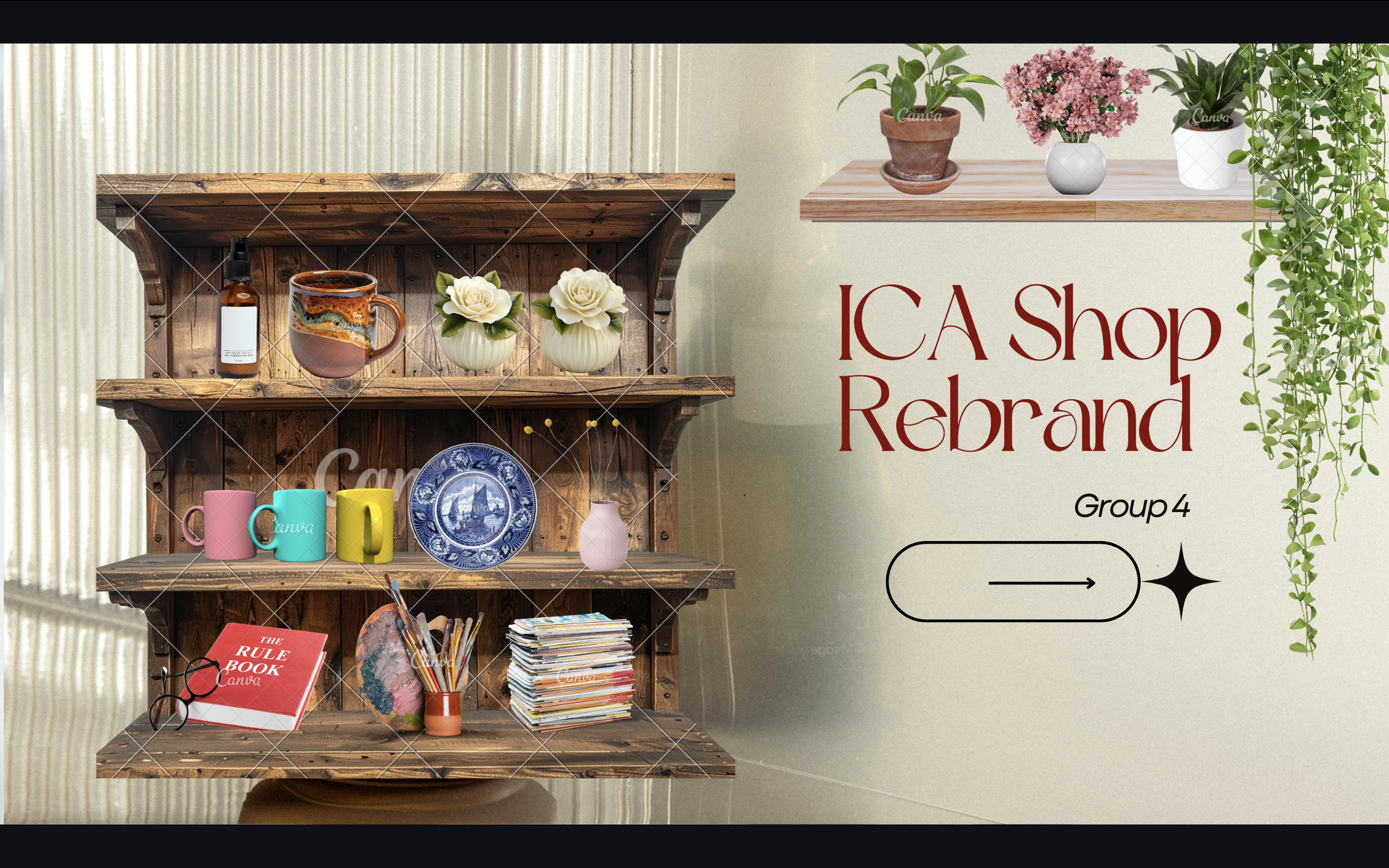
Tasked with operating as a branding agency team, we were challenged to develop a strategic brand pitch for the ICA Store in a highly competitive, time-sensitive environment. Working collaboratively, we researched the brand, its audience, and market context to create a compelling 10-minute presentation that effectively positioned the client for long-term success. With multiple agencies pitching simultaneously, the objective was to deliver a well-informed, persuasive strategy that demonstrated both creative direction and a strong understanding of the ICA’s identity and consumer base.

Meet the Team
The Process
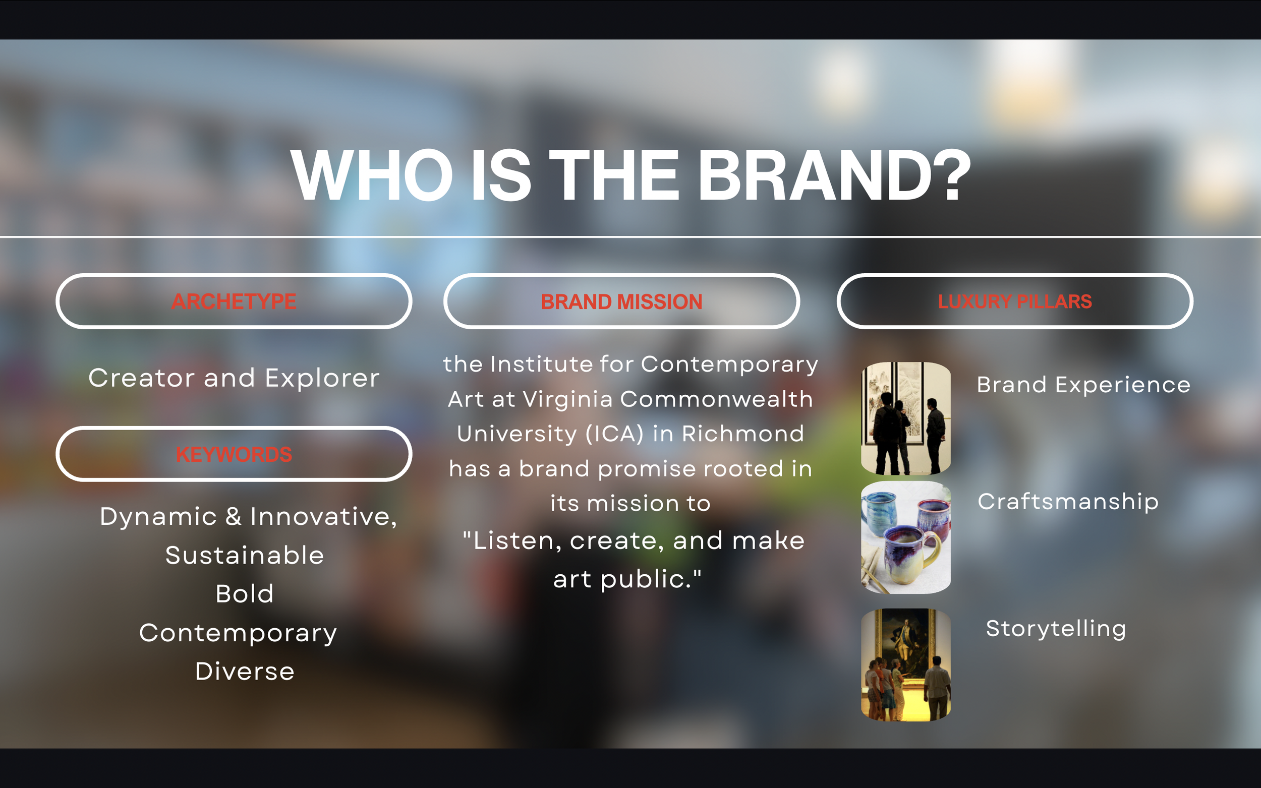
The analysis was conducted in three main phases: Who is the Brand, Who is the Customer, & What is the New Brand Strategy?.
Who is the Brand?
〰️
Who is the Brand? 〰️
- Brand Identity: Diverse, eclectic, and innovative; a dynamic showcase of contemporary ideas with a strong emphasis on sustainability.
- Core Promise: A forward-thinking, non-collecting institution dedicated to making art public, fostering dialogue, and amplifying underrepresented voices.
- Brand Pillars: Elevated brand experience, thoughtful craftsmanship in curation, and compelling storytelling that connects art, artists, and community.
Who is the Customer?

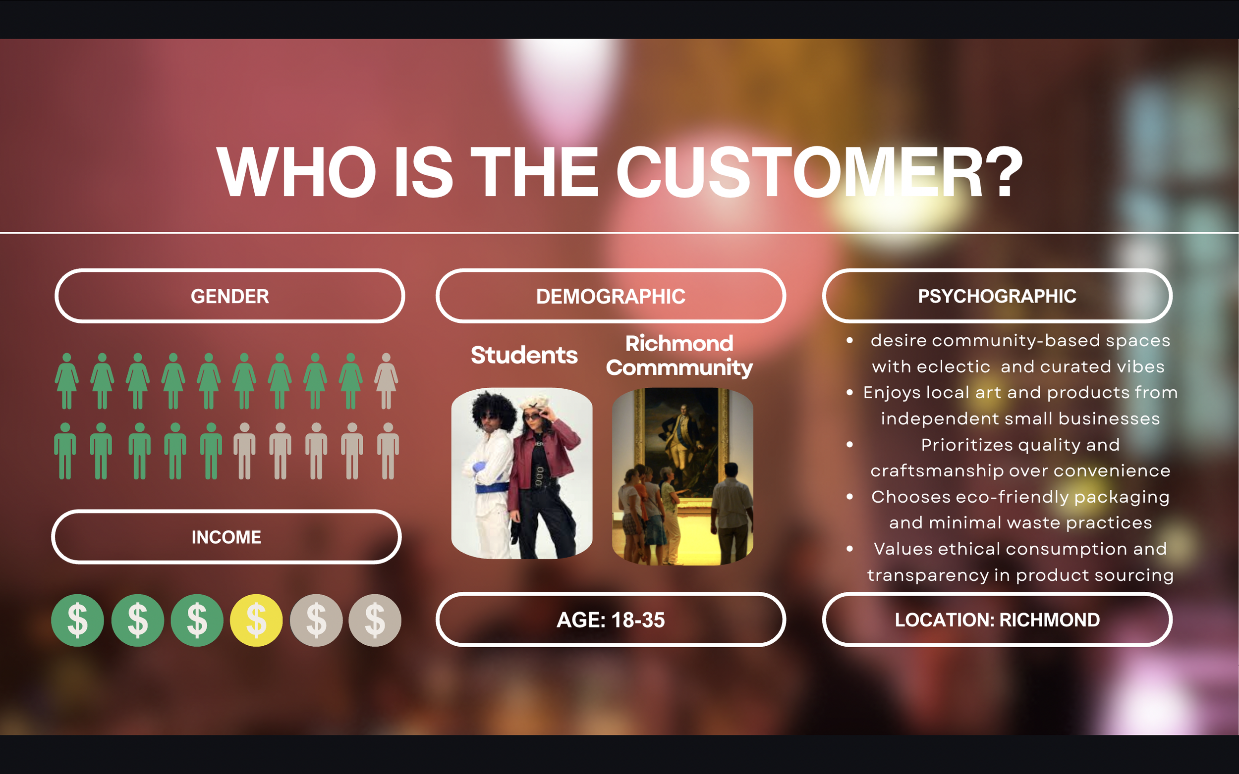
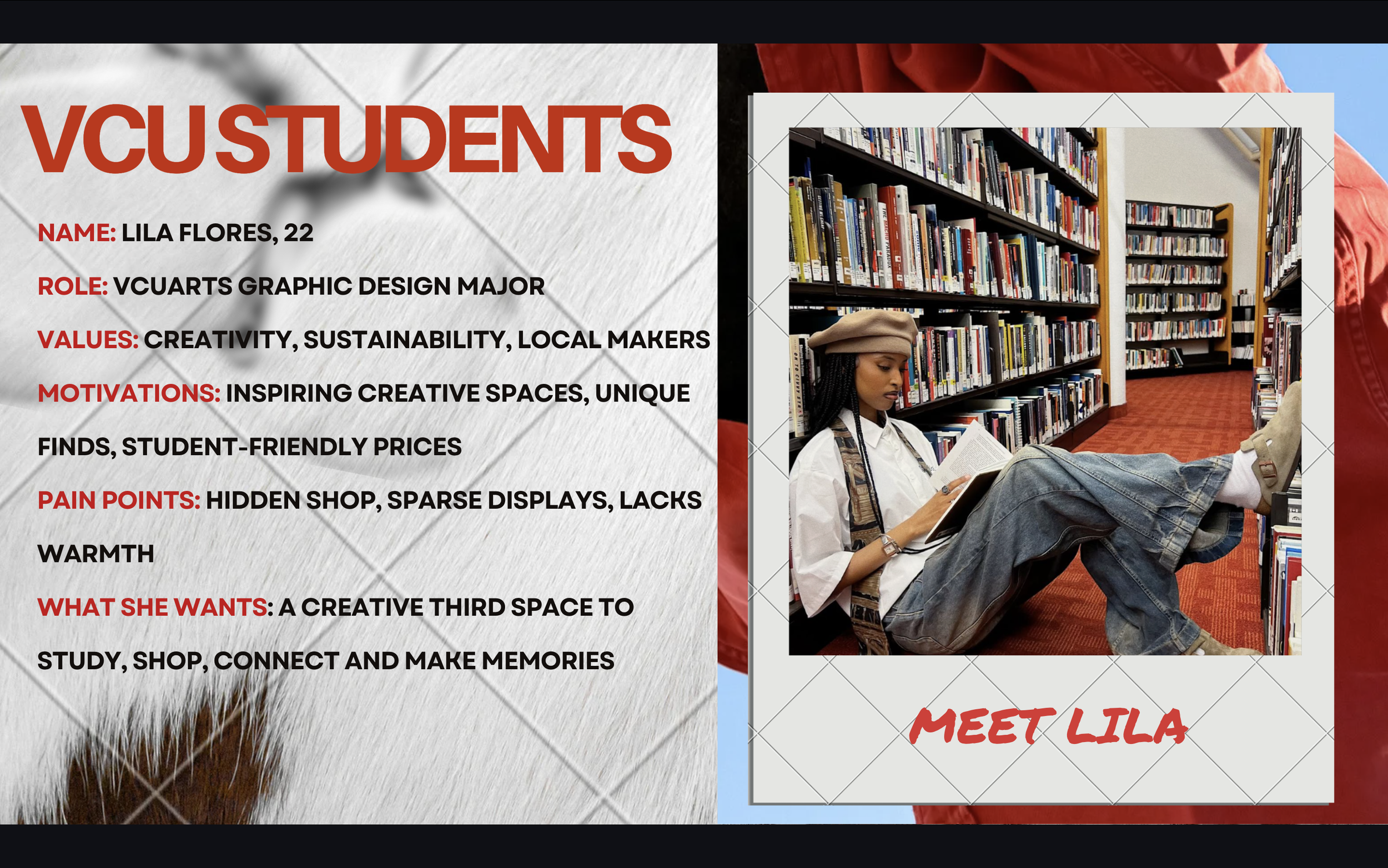
Name: Lila Flores, 22
Role: VCUarts Graphic Design major
Values: Creativity, sustainability, local makers
Motivations: Inspiring creative spaces, unique finds, student-friendly prices
Pain Points: Hidden shop, sparse displays, lacks warmth
What She Wants: A creative third space to study, shop, connect, and make memories
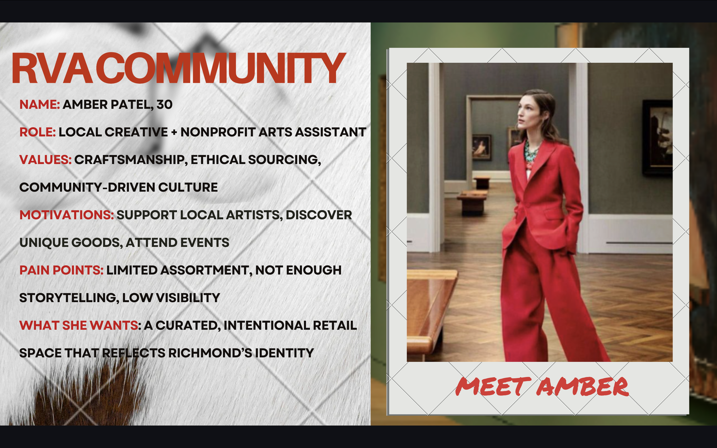
Profile & Values: Creative, budget-conscious student seeking aesthetic, low-pressure spaces; values sustainability, local artists, and curated, “cool-girl” environments.
Goals: Discover unique, expressive pieces, stay inspired in creative spaces, and connect with Richmond’s arts scene through fresh, rotating experiences.
Pain Points: Limited visibility, sparse and non-student-focused merchandise, lack of atmosphere and seating, and few affordable yet meaningful options.
Why It Works: The reimagined ICA Shop becomes a warm, creative hub with rotating local goods and accessible pricing—transforming it into a go-to space for studying, shopping, and community.
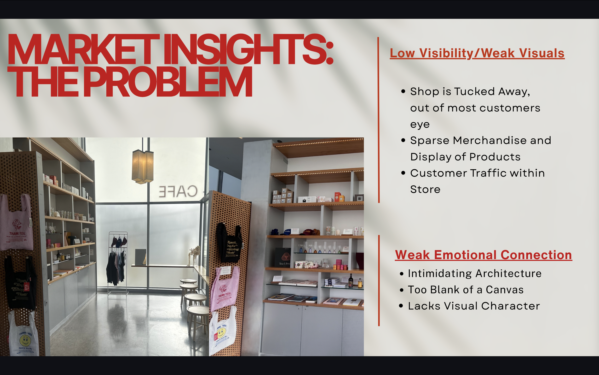
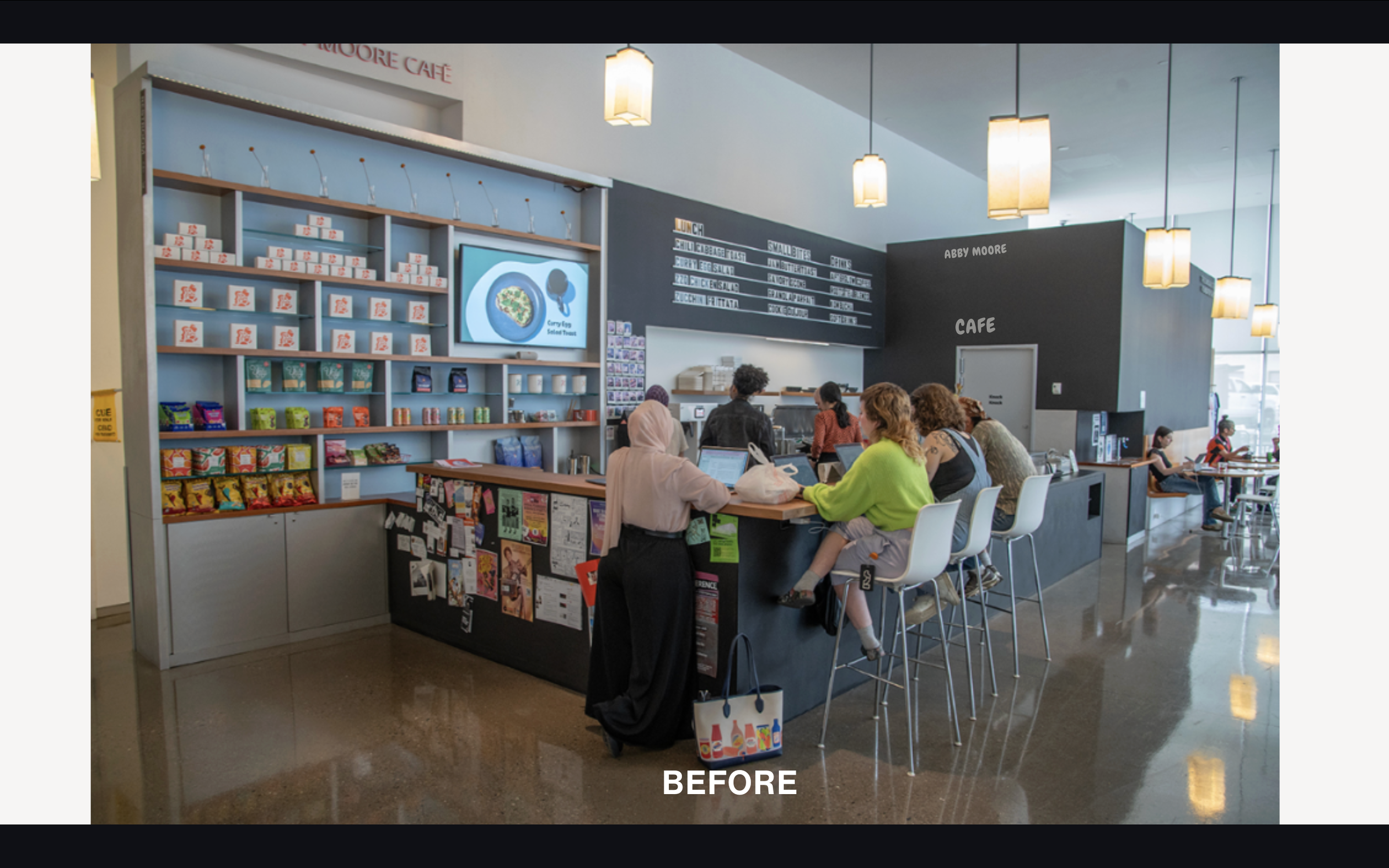
The Current Issue…
-
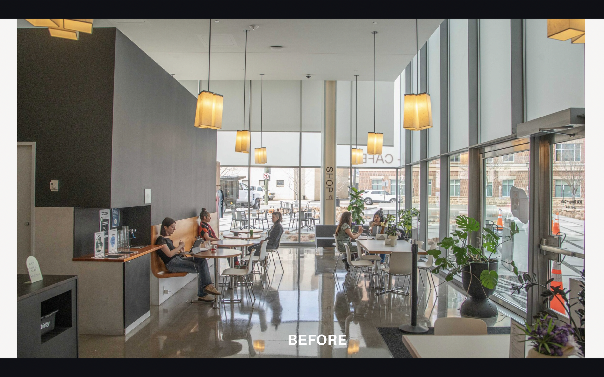
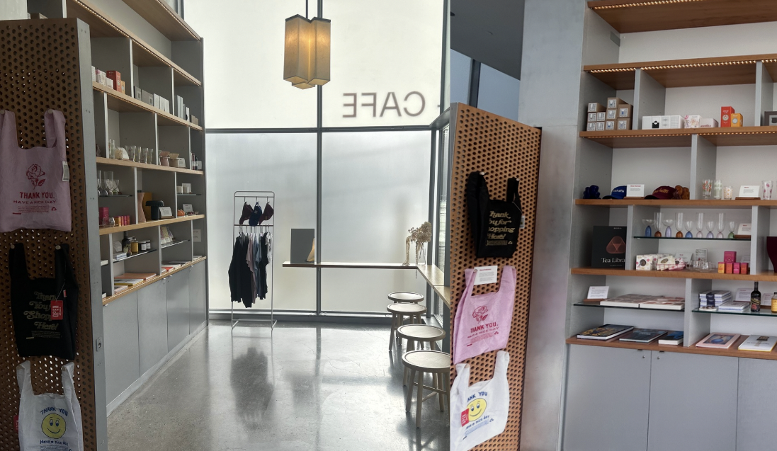
Shop is Tucked Away, out of most customers' eyes
Sparse Merchandise and Display of Products
Customer Traffic within Store
-
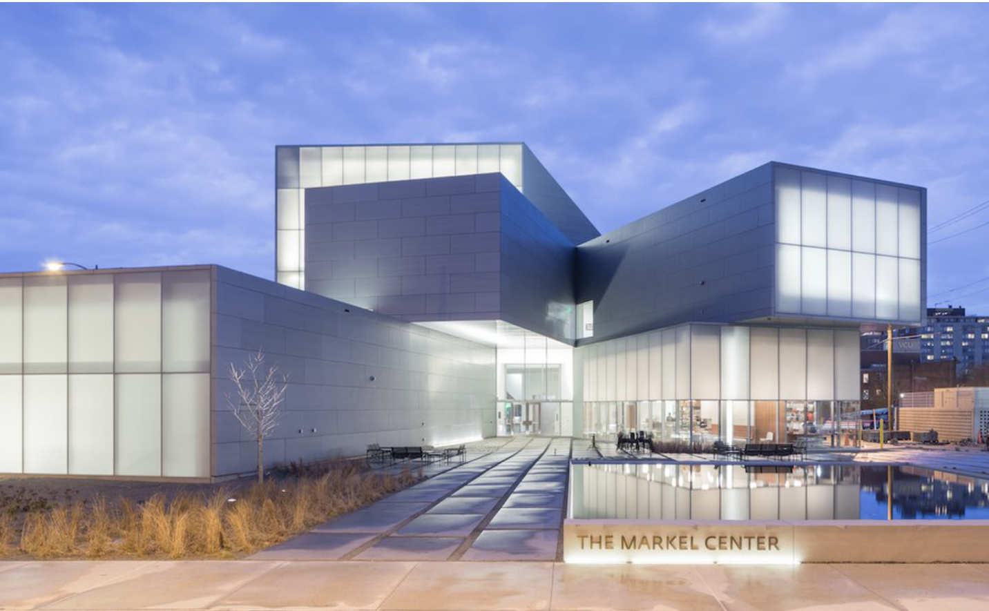
Intimidating Architecture
Too Blank of a Canvas
Lacks Visual Character
The Outcome
〰️
The Outcome 〰️
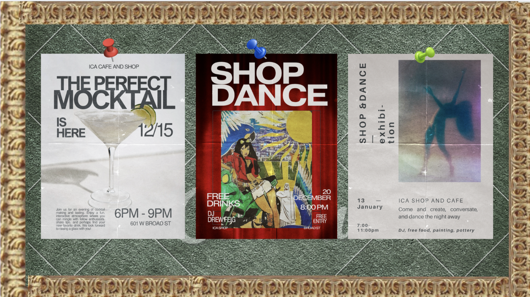
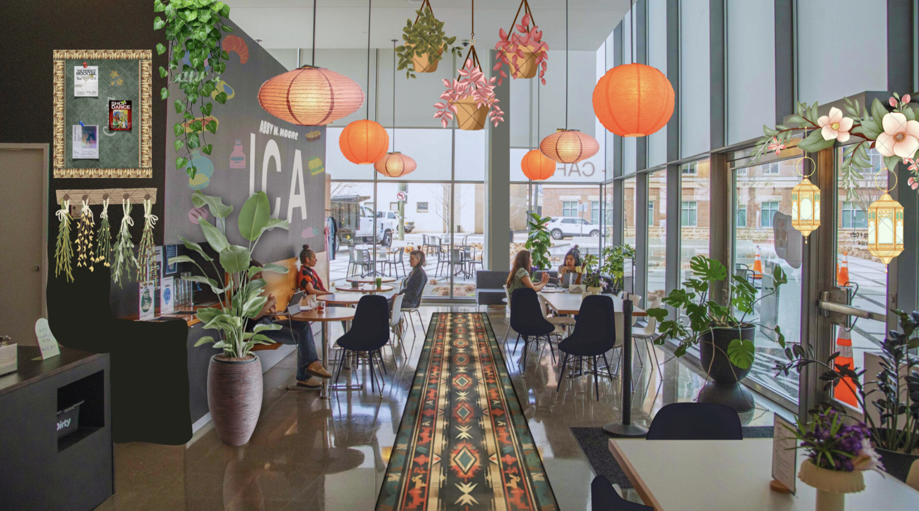
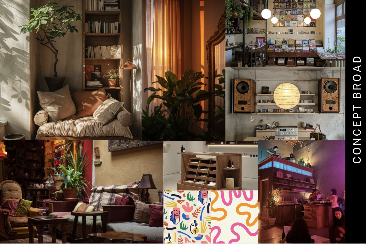
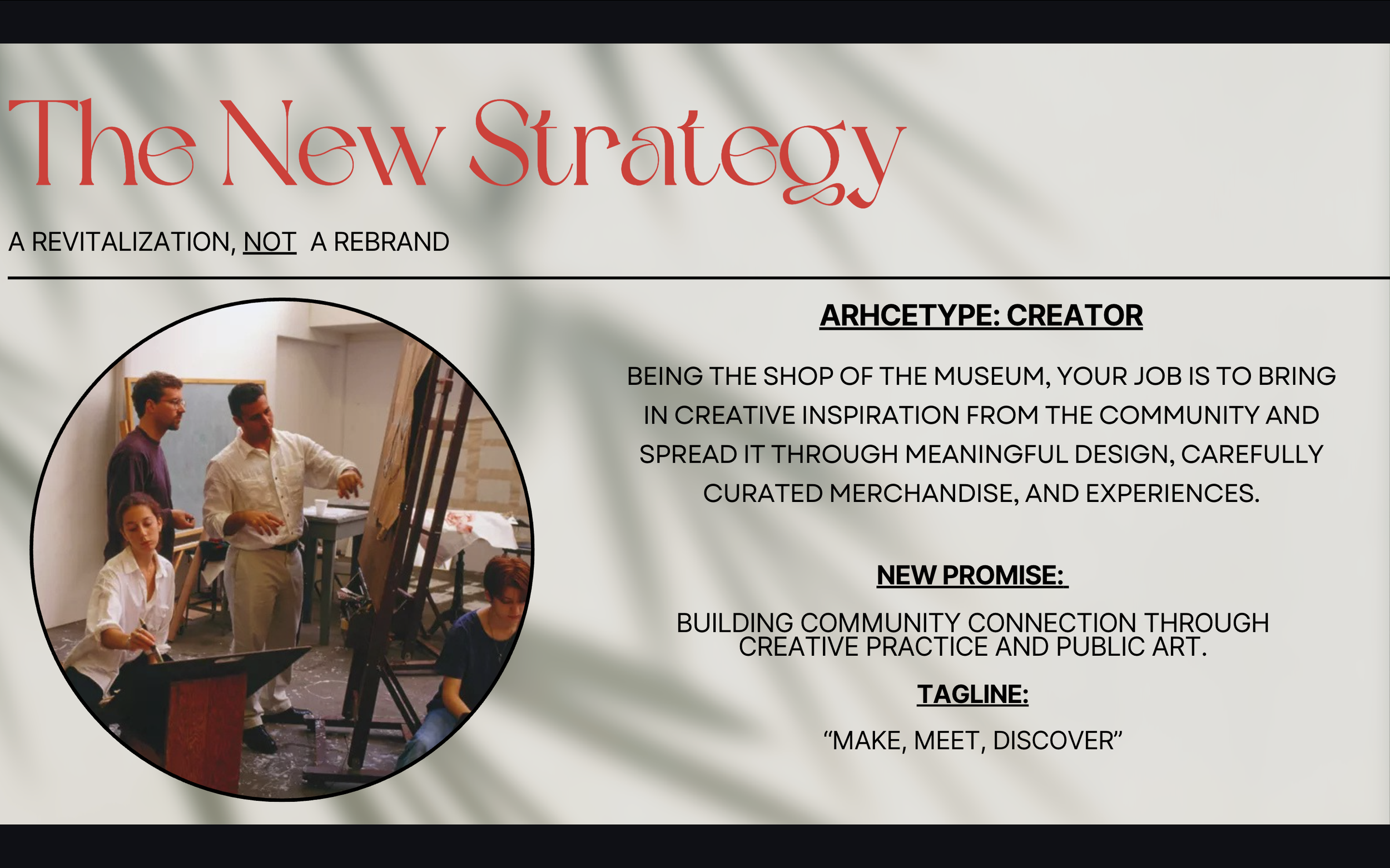
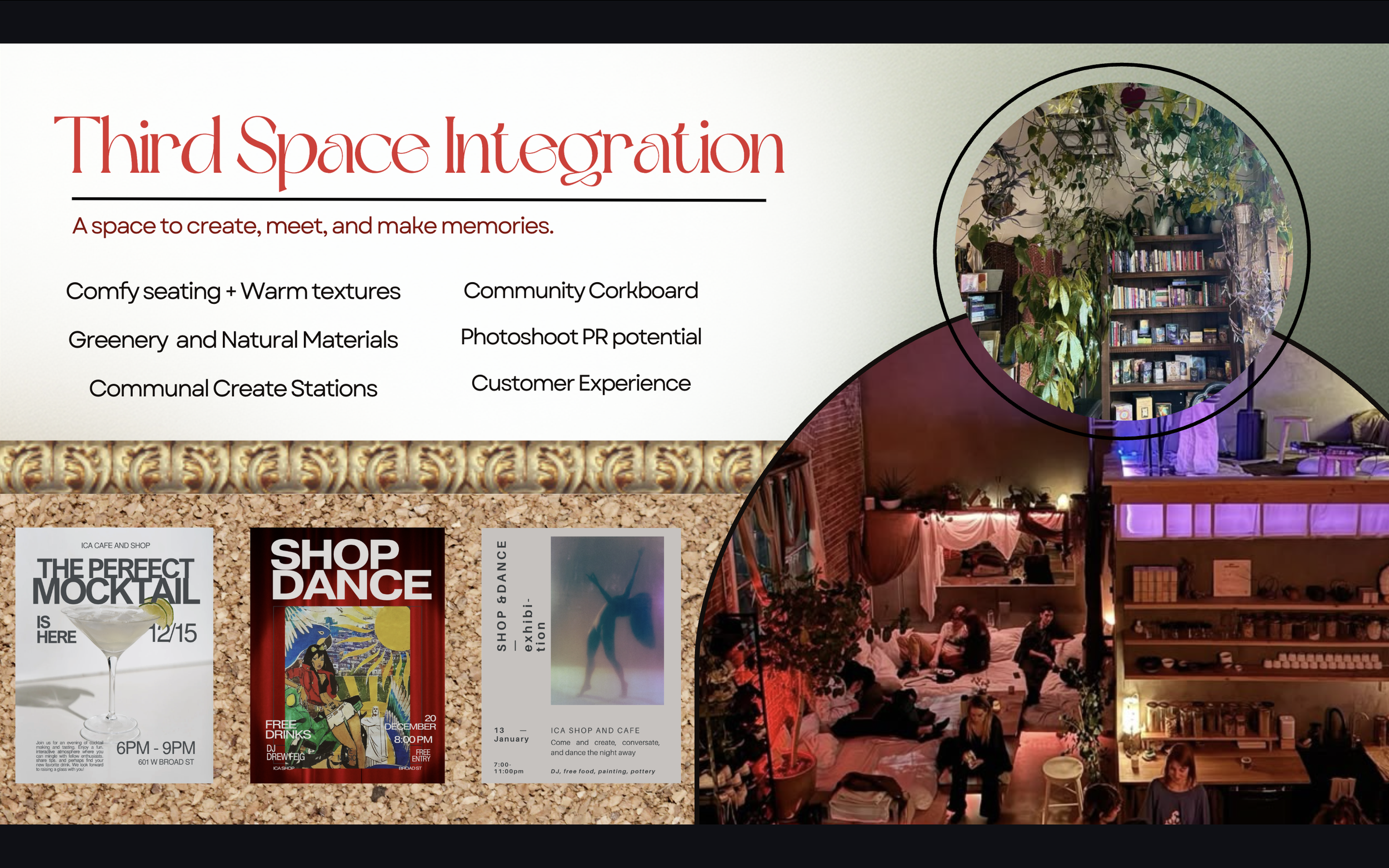
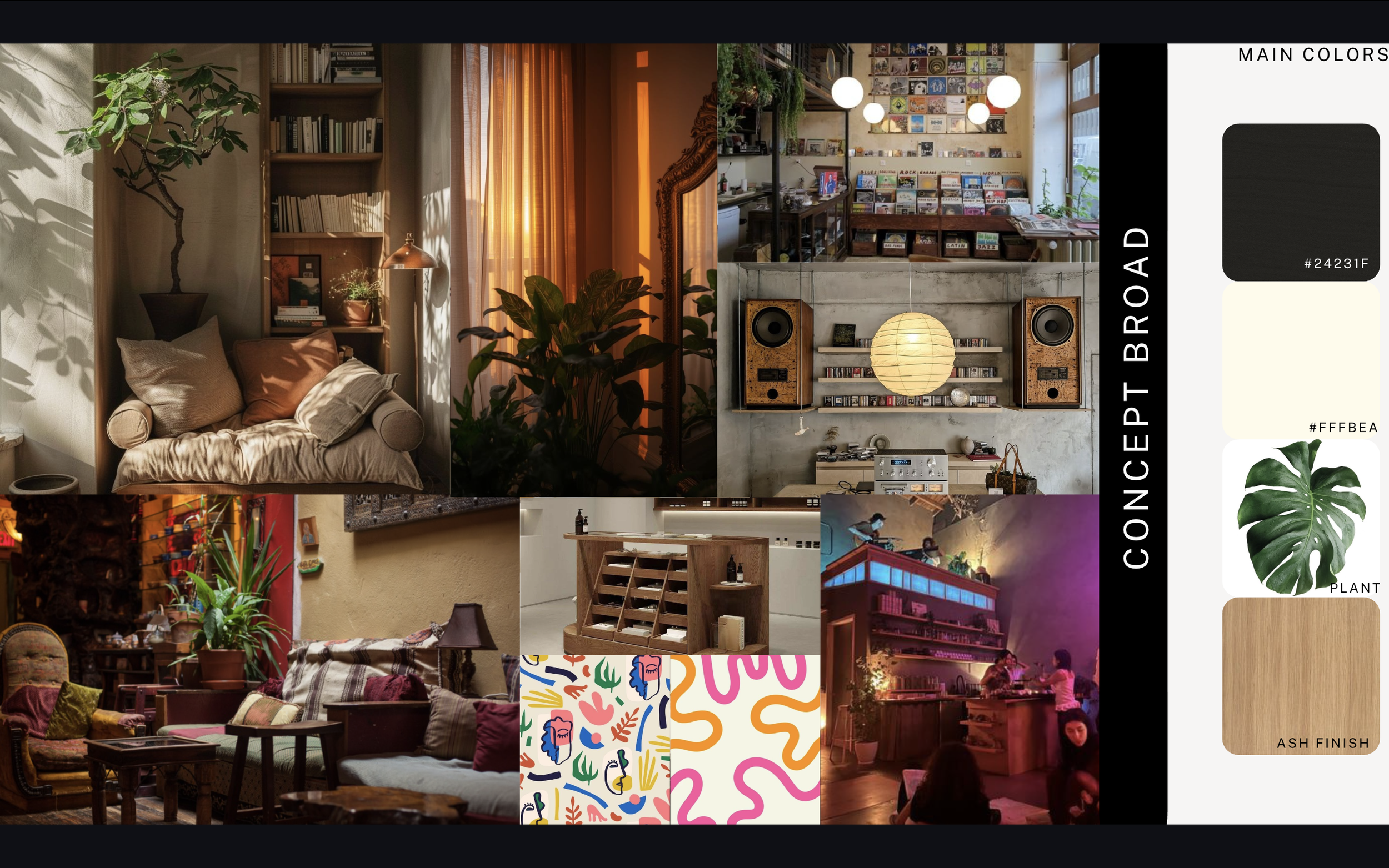
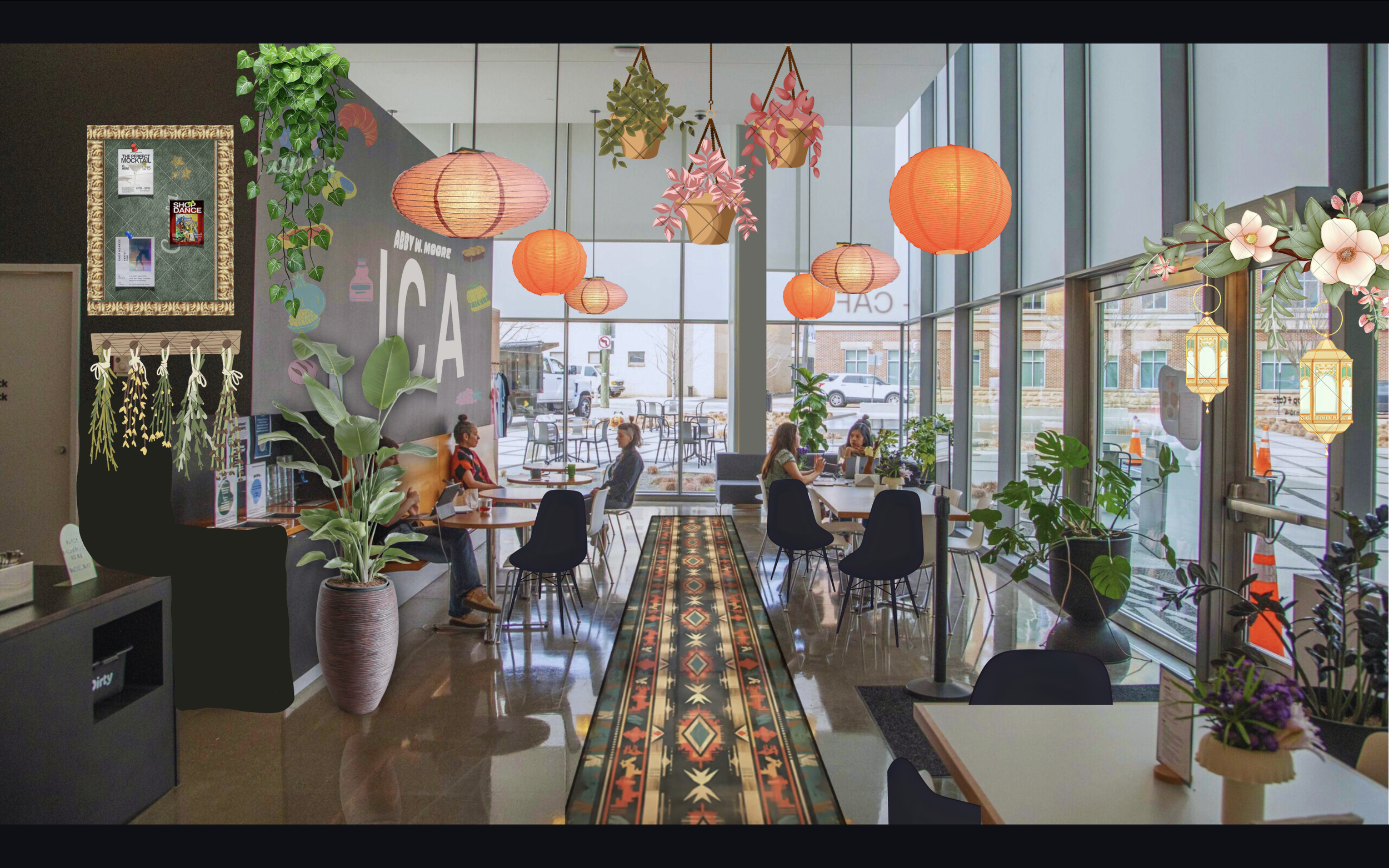
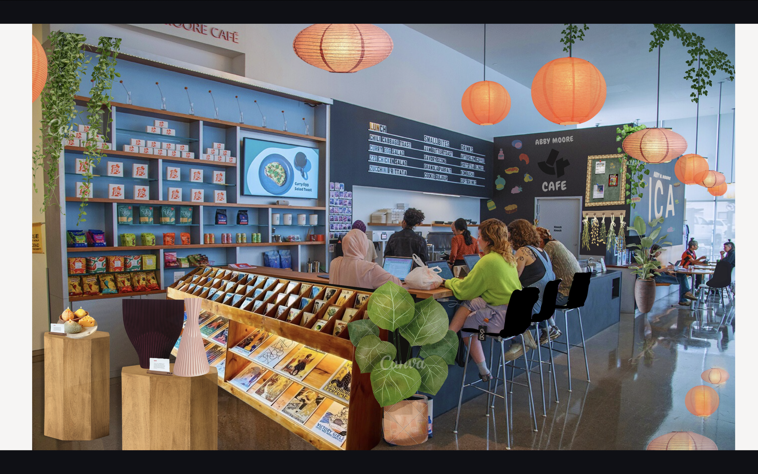
This strategy is not a rebrand but a revitalization designed to strengthen customer touchpoints, increase shop visibility, and build community. The new brand promise, “Building Community Connection Through Creative Practice,” supported by the tagline “Make, Meet, Discover,” centers the Creator archetype to inspire meaningful, lasting experiences. Visually, the space maintains its minimal black-and-white identity while introducing warm wood tones and greenery to transform it into a welcoming third space for studying, socializing, and creating. Relocating the shop toward the windows and incorporating bold, sculptural displays makes the retail area a visible and engaging focal point.
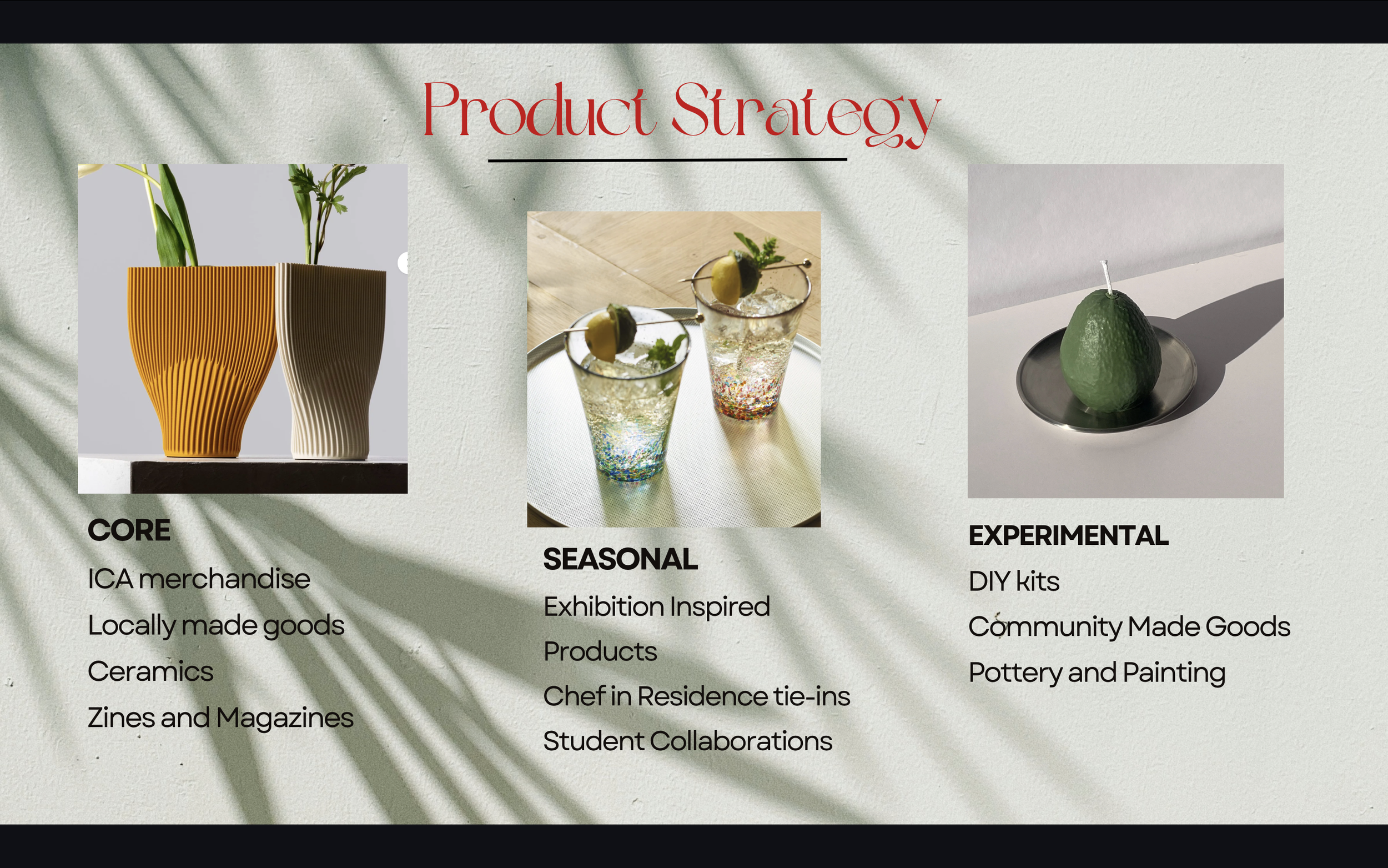
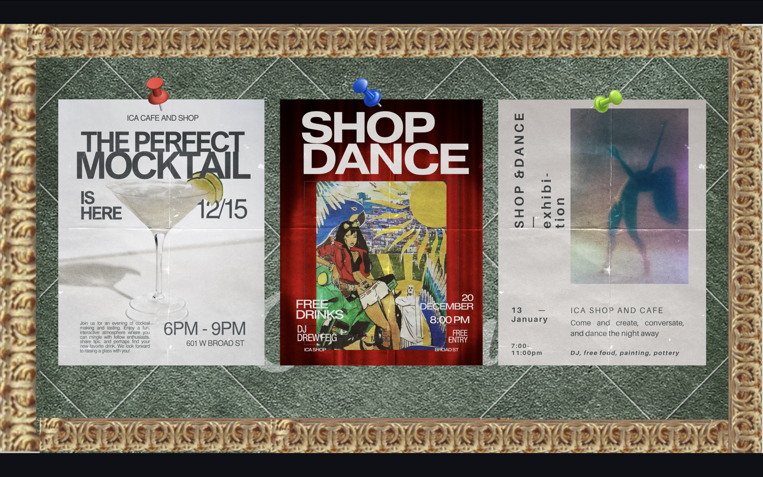
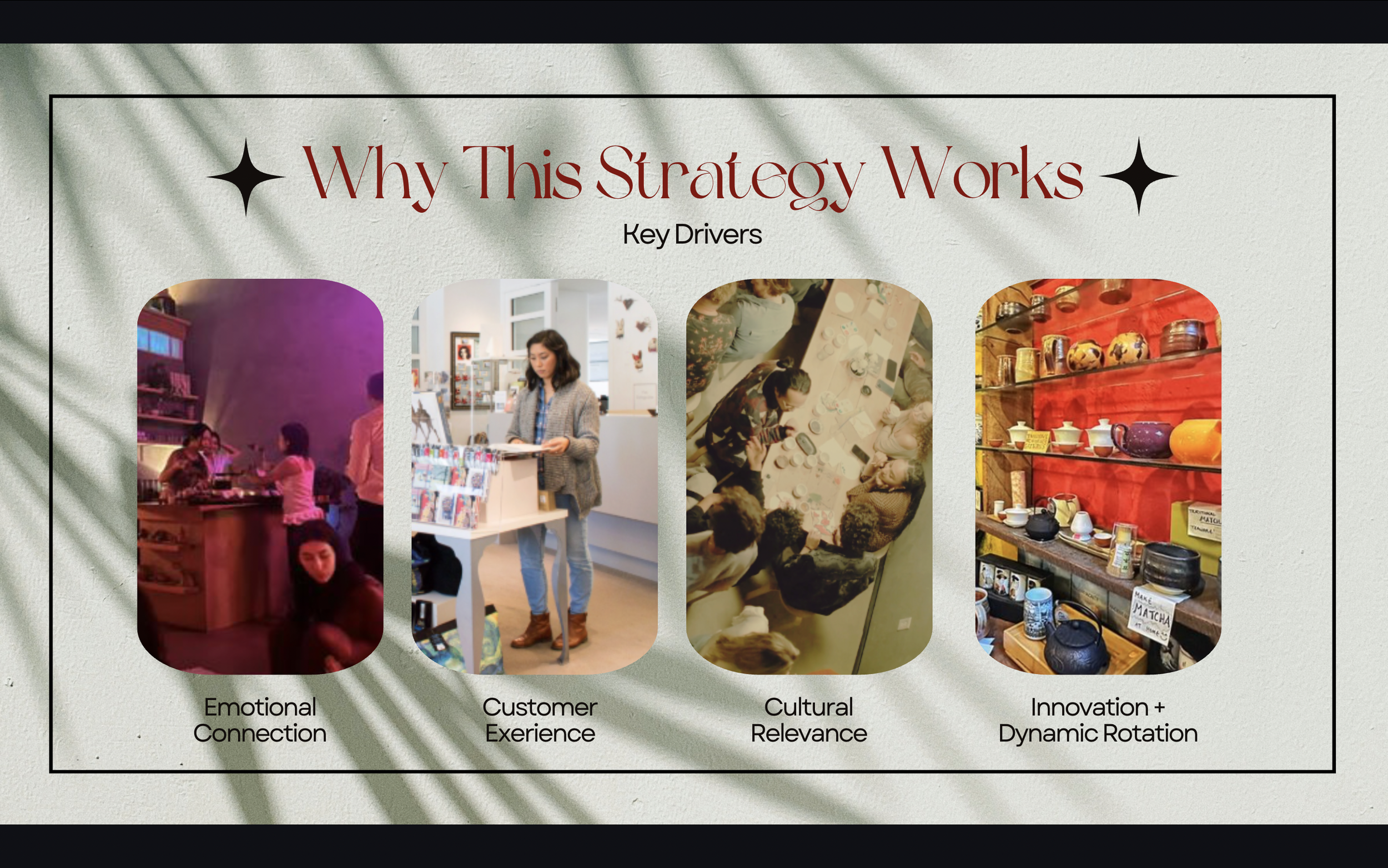
The product strategy expands on a strong foundation with core items (ICA merch, local goods, ceramics, zines), seasonal offerings (exhibition-based and student collaborations), and experiential products like DIY kits and community-made goods. Together with interactive elements like a community board and rotating displays, this approach enhances customer experience and encourages repeat visits. Overall, the strategy works by fostering emotional connection, aligning with Gen Z’s preference for flexible and social environments, and increasing foot traffic, visibility, and sales while reinforcing the ICA’s mission to make art public and engaging.